Link: Data visualization
A QQ plot helps us see if the data fits a distribution.
Let’s take Normal distribution as an example:
Steps to do a QQ plot for normal distribution
Step 1: give each point its own quantile
Step 2: get a (any) normal curve
Step 3: Add the same number of quantiles to the curve
Step 4: Plot the QQ plot
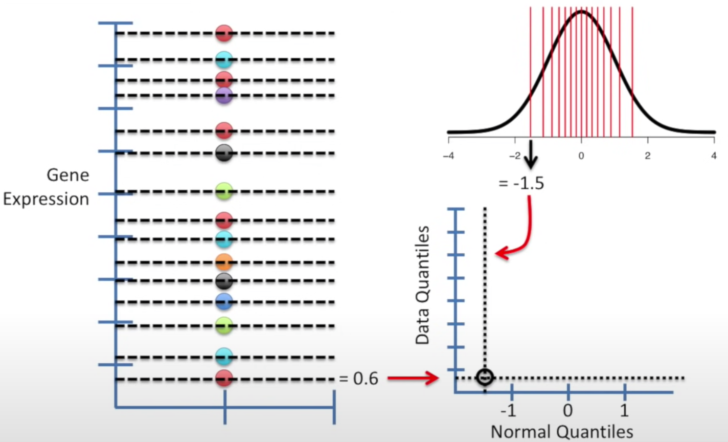
Get the x coordinate from the line in normal distribution, and get y coordinate from the data set. For each quantile, we draw a dot and we will get a QQ graph.
Interpret the results
If most dots fit a straight line, the data is normally distributed. If many of them did not fit, we should consider other distributions.
Compare two dataset with QQ plot
QQ plot can be used to compare datasets and see if they have similar distribution.
Example: Compare dataset to another smaller dataset
The new dataset only has 4 quartiles.
The steps are similar. We take the dataset with the smaller size and determine the another data set with the same number of quantile. Then get the x from the new dataset, and y from original dataset.
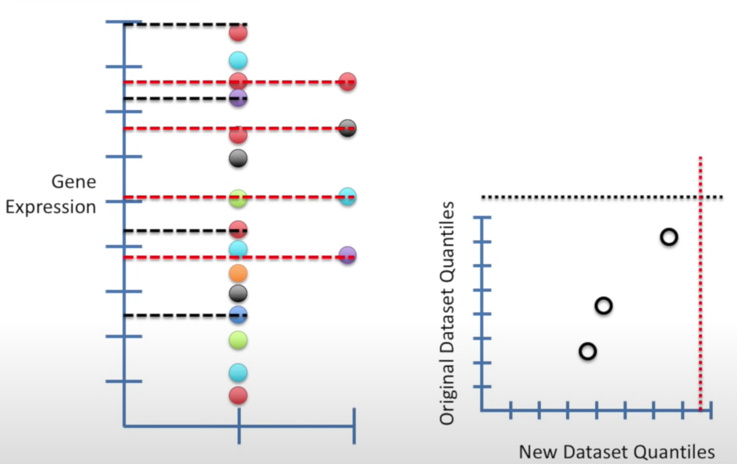
Once we get the dots, we can add a straight line to see how fit it is. If it fits well, meaning the two datasets similar distributions.